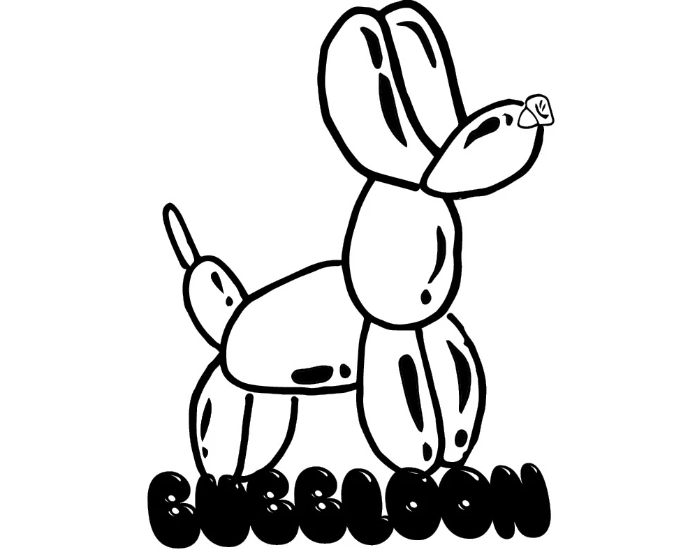
@Justjoshngotbored
justjoshngotbored   

Joshua Molina Designs

Into The Music Coachella Poster Designs

My Into the Music design task was to create an 8x8 typographic poster for a music festival, such as Coachella. To prepare, I reviewed various typographic design examples and studied actual festival branding and type treatments to better understand the visual language used in music event promotions. The most challenging aspect of this project was working without the use of color or images and relying solely on typography to be creative and expressive. To make my design stand out, I focused on using negative space and strong contrast to create visual interest and hierarchy. I did not use type as an image; instead, I allowed the arrangement and weight of the text to carry the design. The fonts I selected for the final piece were Impact and Haettenschweiler, both of which helped deliver a bold and dynamic visual style.
10 rules of graphic design book

In this project I built a book on the ten rules of graphic design. The Task given to us was to use ten of the 20 rules of graphic design, write the description along with the title, and then choose an image that corresponded with the rule. To prepare for this I had to have a better understanding of each rule. After I understood each one better, I looked through the images that were given to us through a link that was shared and found an image that most related to the term. My concept was to be abstract and simplistic. I wanted to work with less rather than more which mostly relates to rule five. The visual elements of my concept are the background and the size of each text or number.
Galactic Grub Menu

This is a menu for a fast food restaurant called galactic grub that is space themed. The colors that are used are yellow, red and white.
Back to the Streets Urban Film Festival Posters

The objective of this campaign was to build excitement and cultural awareness for1970s Urban Films. The goal was to capture the raw energy and emotion of 1970s cinema while engaging both film enthusiasts and new audiences through immersive, multi-platform storytelling. The campaign utilized a mix of digital media, video signage, and traditional print advertising to create a unified, nostalgic aesthetic.
Bubbloon

Bubbloon is a fun, fruity soda brand that blends bold flavor with playful, imaginative design. Inspired by balloon animals and the joy of childhood, Bubbloon features lightly carbonated drinks made with real fruit flavors and natural ingredients. Each can showcase an illustrated balloon-style animal that represents a unique flavor, making the product both collectible and visually appealing. The soda is crafted with carbonated water, natural fruit juice or flavors, a touch of stevia or monk fruit for sweetness, and prebiotic fiber like inulin or chicory root for digestive health. It also uses natural colors from fruits and vegetables, along with citric acid and vitamin C for freshness and added benefits.
Saul Bass Magazine Feature

The task was to create magazine page spreads that included pull quotes on the facing pages that were heavily inspired by the artist. The most challenging part was finding out how to use pieces of Saul bass' work and incorporating it into mine. The color palette for the magazine is mainly yellow, white, and black. The reference for the color yellow was from his piece he made for the movie The Shining. I did not use type as image but i used type for an image area and used positive and negative space in my design by incorporating image into type. The font I used for the first spread was tripper pro black. For the sub header used the font OCR A Extended at 25-point size. For the pull-out text the font used was Eras Bold ITC. The body text uses minion pro at a size of 13.
Yot Club Band Illustration

This illustration was made for an indie band called Yot club.

Figure Photography